Make People Happy (Part 2) - Putting the “You” in UX
This article is part of our special two-part UX series featuring Top Chef’s Tom Colicchio. You can revisit part one here.
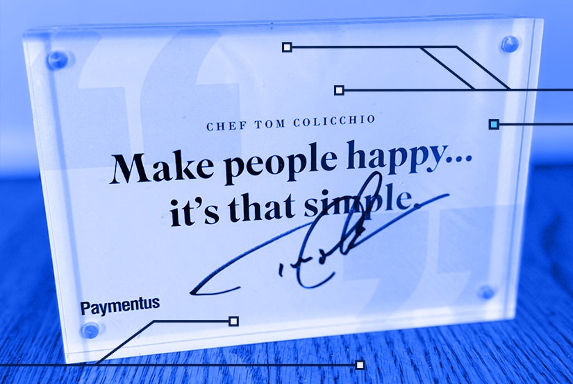
In part one of our UX special, we focused on award-winning chef and restaurateur Tom Colicchio’s three guiding principles of making people happy:
Be on the side of your customer
Everything should be a “yes”
Commit to service with a focus on hospitality
In part two, let’s unwrap the impact UX can have on your organization’s performance, the characteristics that define great UX and how organizations can take a customer-first approach to UX.
The Importance of UX By the Numbers
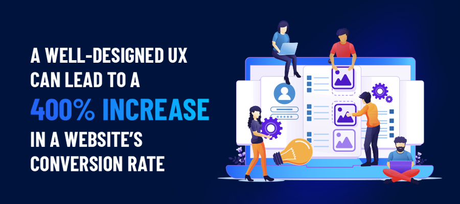
There are many tangible benefits and reasons billers must focus on UX. Forrester’s The Six Steps For Justifying Better UX trend report showed:

Defining Characteristics of Effective UX
Simplicity
Loyal Apple users will tell you that one of its greatest strengths lies in its UX. The simple, clean design associated with Apple’s products make them easy and enjoyable to use. What’s more, the ecosystem that Apple has built among its products simplifies the adoption of other Apple products. By being on the side of their customers, Apple has created a very (very) loyal following.
The ideal bill pay experience is one that strips away unnecessary items or actions and focuses solely on answering the following: does this help my customer view, track, pay and manage their bill? If the answer is no, leave it on the cutting room floor.
Intuitiveness
When it comes to your bill pay experience, would you describe it more as a guided tour or scavenger hunt? Intuitive design delivers both the shortest route from point A to point B but also the clearest path.
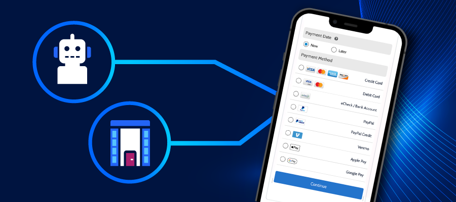
For instance, the Paymentus platform offers a linear path for customers, whether they are paying by credit card through the online portal, in-store with cash, through a chatbot or by mobile device using a digital wallet.

Intuitive payment experiences also include seamless navigation and properly organizing account management links. It’s essential to establish a hierarchy and ensure all information contained within designated areas makes sense from a user perspective. There’s a reason restaurant menus break items into categories. Your bill pay menu should be just as organized and easy to read.
Aesthetics
A sleek, modern design is far from window dressing. Which site would you have more confidence in, the one that appears to be 20+ years old or the one that looks like it’s built for today’s devices?
This applies to every customer touchpoint across all devices. A design aesthetic that is consistent from end-to-end lets customers know that you have accounted for the entire billing and payment ecosystem, and provides opportunities to establish your brand as a modern one.
The Customer-First Approach to UX
Having a simple, easy-to-navigate digital presence is just a start. To earn full marks, billers must extend their UX strategy with a strict focus on answering the following question:

The Paymentus billing and payment solution provides everything billers need to answer this question in full. Much like Tom’s restaurants, our platform has accounted for every inch of the customer experience.
It starts by offering an inclusive menu of payment methods and channels. This is how you ensure no customer is left behind and make everything a “yes.” If a customer wants to use AutoPay, they can. If they want to earn credit card rewards, they can pay by card. If their financial situation is driven by cash, they still have access to a modern, convenient experience.
How can you further advocate for your customers (i.e., be on their side)? Notifications and reminders. Customers want to pay on time but when paying multiple bills per month, it’s easy to forget a bill here and there. Email and text reminders sent in advance or past due reminders offer customers a safety net that keeps their account in good standing.
And don’t forget real-time confirmations. Don’t leave customers guessing or waiting when it comes to their payment status. This peace of mind is invaluable and can also help prevent calls questioning the status of a payment.
Achieving Usability
The best way to offer customers a system defined by usability is to work with a best in class partner like Paymentus. You’ll get the holistic solution without the need for additional vendors, stifling gateways or complicated integrations.
It’s also important to view your data and understand what it means. High call volumes, low adoption rates, abandoned payments, etc. are likely signs that something is amiss within your UX. Key data can help you pinpoint these issues, which your billing and payment partner can then address.
Ultimately, the key to making people happy is to put your customers first – all of your customers. Consider the outliers and slow adopters. Is your billing and payment process geared toward those who have been paying bills for decades or those who may be making their first bill payments as they enter adulthood? The only acceptable answer is that it’s usable for both – and everyone in between.
Want to learn more about the many facets of optimal UX? Check out our on-demand Innovation Series featuring webinars on cash bill pay, advanced notifications, payment plans and more.


